Chelsea De Colle is a Holistic Nutritionist based in Vancouver, BC who wanted to have some branding created as she develops her career in this field with one-on-one clients, workshops and growing an online presence.
The logo was kept clean and balanced to reinforce her professionalism and modern personal style, as well as it being versatile for different applications.
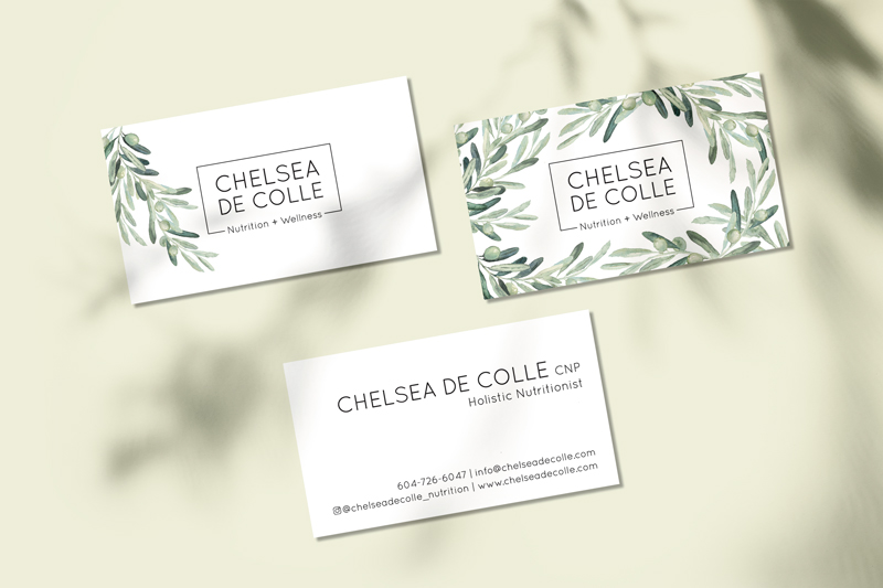
The business cards feature watercolour style olive branches that are creative and calming, while also creating movement and balance around her logo. There is also significant meaning to the olive branch as it’s “a symbol of peace and reconciliation and it represents [her] desire as a Holistic Nutritionist to support you on your journey to health through reconciliation with your body and your relationship with food.” (chelseadecolle.com)
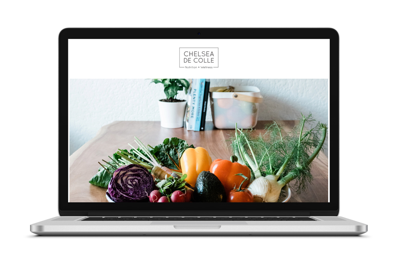
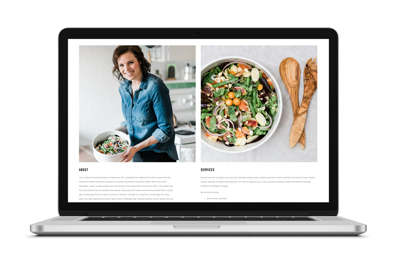
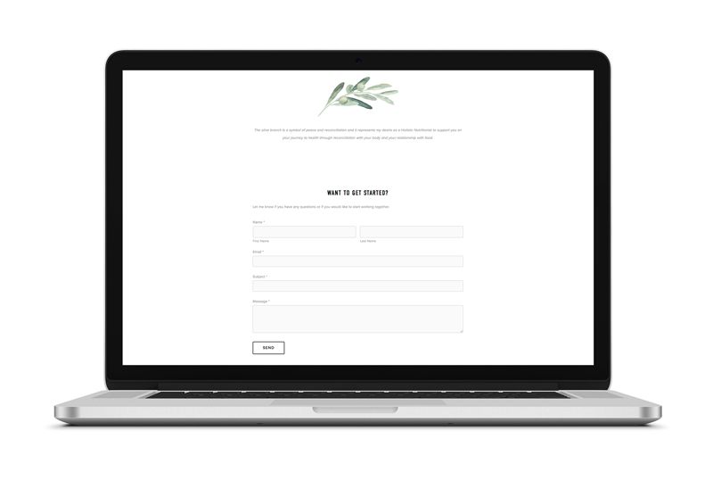
The website needed to be one page that was fresh, simple and provided key information for visitors. Beautiful photography was used to bring life and contrast to the simple white background and modern typography with welcoming bright pops of colourful food and elements of human connection that Chelsea values in her work. Lastly, the olive branch artwork was brought in to add the connection between the business card and contact section of the website, while also giving the opportunity to share the meaning behind it.
![]()
© 2025 Maddy Bazett. All rights reserved.
